2 days ago
You have to get creative when you lack a strong visual. This month’s design trends roundup focuses on this concept.

Have you ever started a design project that was just hard to show? Or maybe one that didn’t have many video or photo assets to work with? That’s when designers have to stretch their creativity to come up with interesting and engaging concepts that will still keep users scrolling and clicking.
This month, our design trend focus is on three trends that suggest that things are somewhat difficult.
Here’s what’s trending in design this month:
1. Homepages with Typography Focus
When you don’t have many other elements to work with, the go-to option is often typography. There are so many great and fun ways to use text elements to grab user attention and tell a good story online.
The challenge with this design trend is thinking responsively. You have to take special care with how text elements respond on different device sizes to ensure that everything is still readable and your effects come across seamlessly. (This is sometimes tougher than it might seem.)
The reward here is that users know immediately what your website design is about because there’s often large text on the screen that tells them right away. No guessing here!
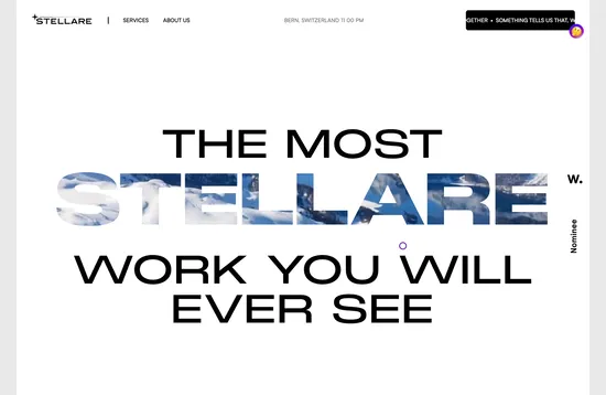
Stellare uses its brand name with a color/background motion technique and a clever pun to grab your attention right away. (Did this technique work for you? It made me grin.) It works in part because the design is so simple. You don’t need to know what the video is in the background to understand the text. Everything is easy to read with simple text choices and a high focus on one key word.
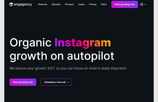
Engagency is a similar business type – also an agency – but takes a totally different approach to a design-with-typography homepage. Here, the visual element is emphasized by contrast, from a dark background with stark white lettering to a single word with a colorful gradient for attention.
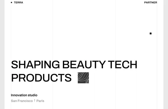
Terra
takes the most stark approach of all, using whitespace to help users focus on the type element. There’s also a square mouse hover option that matches the shape on the screen to tie everything together in a simple but connected way.
2. Overlapping Elements
When you lack a single key piece of imagery, a better option is to use space or allow elements to encroach on each other’s spaces to create visual interest. This is another rather tricky technique that can be difficult to design on multiple screen sizes.
On the other hand, when it works well, this technique can have a stellar effect.
Overlapping elements can include text against background or foreground elements, images or video and text, or even small images, illustrations, or animations that overlap other elements (text or imagery).
When designing with this trend, it is important to pay attention to how elements interact so that everything remains readable and so that important information is not covered up.
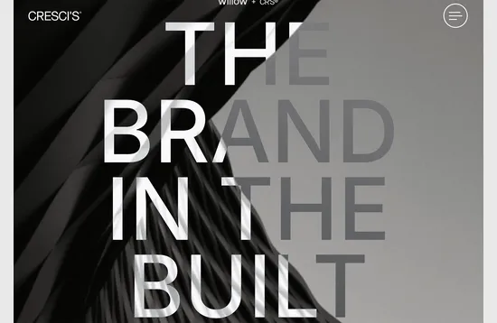
Cresci’s uses an overprint effect to make text elements seem to merge in and out of the background. The homepage design is stark, but the texture, oversized text, and overall effect are definitely attention-grabbing.
Christina Hohner
allows both images and text to overlap in various ways on her homepage. She’s trying to emphasize multiple things by showing what she does and using images to match.

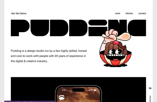
Pudding Studio
uses a fun little animation with a funky typeface in the header to create a lot of visual intrigue. What is this website all about? Thankfully they follow up quickly with a description so the user understands right away.
3. Ways to Show AI
How do you show artificial intelligence? Over the last few months, we noted multiple trends with different ways to show it, including using robotic figures and text-heavy designs.
The focus on how to show AI has shifted again with things that just look kind of high-tech, but aren’t focused on putting a “face” to the technology.
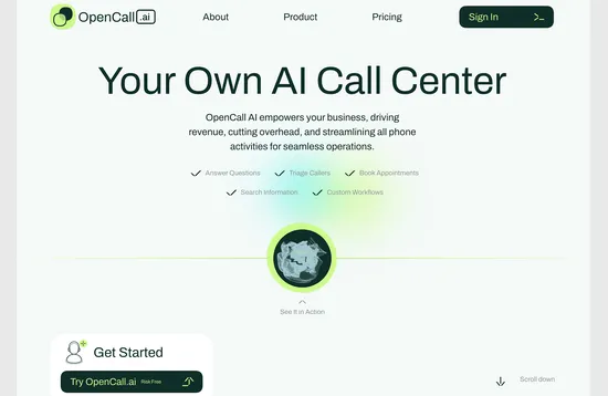
OpenCall.ai uses an animation that maybe resembles a soundwave to show their AI technology. It works because there are enough words and descriptors on the screen that you don’t really need the image. It’s designed to be small for a reason.
Walbi uses two effects at the same time to show their AI – a special text treatment on some of the letters/words in the main headline and the green pulsing element. The latter is becoming almost a trend of its own to show artificial intelligence “thinking.”

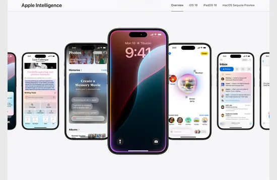
Apple
is getting in on the AI game with “Apple Intelligence.” The landing page shows different elements that iOS is using AI to make your life better. Some of the screens may be recognizable, while others are previewing something new in an upcoming update. This example is the closest to showing AI in action of any of the above, but it also requires the user to already have some familiarity and connect some dots on their own as well.
Conclusion
The most interesting trend here is the last one. While the first two have made rounds and trended in the past, showing AI is a pretty new concept. How do you show computer processing?
It’s a tough concept, but thinking outside the box helps. Do you think you could find an interesting way to show this on your own or would you borrow from a concept you’ve seen elsewhere. It’s great food for thought … and best to think about it before one of these projects comes your way.

