Yesterday
Touchable texture, distinct grids, and two-column designs are some of the most trending website design elements of November 2024.

It’s hard to believe the end of the year is right around the corner. That isn’t stopping website designers from trying new things to keep things interesting as we begin to close out 2024, though.
With texture, grids, and two-column designs getting a lot of attention, this month’s website design trends include things you can try before the year ends.
Here’s what’s trending in design this month:
1. Touchable Textures
The term cozy often comes to mind when you think of cooler temperatures and fall or winter. Just the word can make you feel the texture of a great sweater or blanket.
Now take that concept and apply it visually. That’s the idea behind this design trend with a set of images that look like you can touch them. Just seeing these textures makes you understand how they might feel or interact in the real world.
Blurring the lines between digital spaces and reality has been a trending theme all year, and these designs take that concept to a truly visual level. (I could almost feel every one of these examples.)
The challenge with this design trend is you have to really plan it. You need the perfect visual element – sometimes still, sometimes animated. And it has to look so real that website visitors think they can touch it.
These effects can be from photography or videography, but are rooted in the tactile nature of the artwork and how it interacts with other elements on the screen. Each of these examples does this in a very different way.
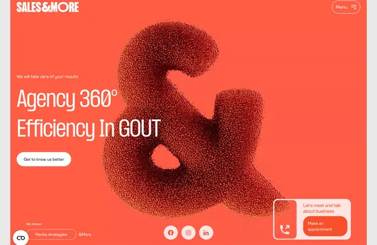
Sales & More uses motion with texture to create something that you can’t quite identify but that still has a reach-out-and-touch-it feel. You can almost imagine the tiny balls moving in your hands or a slight breeze when they move away from the main & shape. A flat background makes this design more striking, with a complete monotone color scheme and plenty of interactivity.
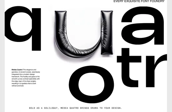
Every Exquisite Font Factory
uses multiple textured items to highlight letterforms and create visual interest. Because of shadowing, a simple background, and unusual usage (textures for letters), you can “feel” each one easily. This design uses a lot of different texture elements with immense detail in the design.
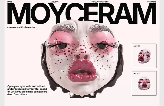
Moyceram features ceramic artwork with images that have a liquid finish you can almost feel. Even the painted eyelashes and eyebrows on the faces seem light and touchable. But the most distinct element may be that each mast looks wet, so that the emotion of each piece shows through.
2. Distinct Grids
There are few things as nice as an amazing grid for a website design. A grid keeps content organized, balanced, and visually pleasing.
While grids are practically everywhere, this trend incorporates seeing them more distinctly than just using a grid for design purposes.
The feel is quite structured, allowing large amounts of content to have its own place without feeling cluttered. These designs can take a lot of shapes and fit with almost any type of content. The biggest driver is your need to organize.
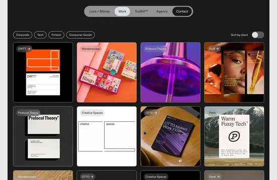
Love and Money Agency uses a simple square block image grid to showcase their work. Blocks mix and match photos and moving images. Some blocks link to work and also feature hover states; some do not. This grid is clean and easy with a sort of create-your-own-adventure feel thanks to varying content types.
Haydaysss uses a grid that looks and feels like a calendar. This is a visual that most people understand with ease. What’s more interesting here is that is all you get on the homepage. The grid design is for content access and entry and well as navigation. Each block has a simple hover animation to help you understand that it is interactive, and there’s a motion that crosses the screen every few seconds as well to keep visitors interested.

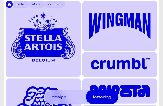
Alec Tear follows our theme of grid boxes with his portfolio site. The monotone look is rather stunning on its own, but it is even more interesting with full-color hover states that lead you into different pieces of work. With an almost brutalist feel, this design aesthetic helps counterbalance some of the elaborateness of the work therein. The mono palette also helps you focus on what’s important here—lettering, which is showcased on this portfolio page.
3. Two Columns
Another take on using grids is the two-column format. It is important to note that two columns does not automatically mean two equal columns. (Asymmetry can be rather nice.)
Each example uses two columns to help organize content and provide easily viewable text sections for the website. Full-width text is generally overwhelming to read on desktop screens, making multiple columns a viable option. Two columns also provide a nice logic for responsive stacking on smaller screens.
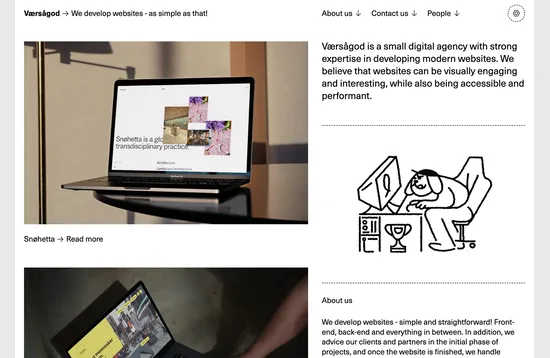
Vaersagod uses two columns that are somewhat independent of each other. The right column features visual work and examples for the portfolio site, while the left column scrolls with text. The theme carries to subsequent pages as well, and you almost have to click and scroll around to get the full feel for how it works.
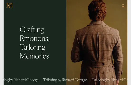
Richard George uses a more traditional split-screen design with two panels – one for text elements and a second for visuals. There’s a reason this design pattern never goes out of style – it works beautifully and is easy for visitors to interact with.
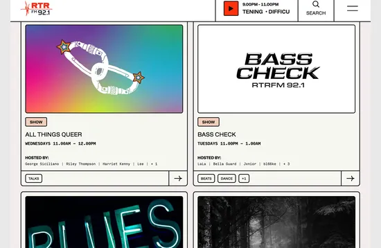
RTRFM uses a great grid overall – you’ll have to click through and scroll to see it completely – but the two-column cards are a beautiful example of how to use two columns and feel super trendy at the same time. With a brutalist feel and plenty of content as well as linkable elements, these cards are highly interactive and handle a lot of information well. Small animated effects add to the overall feel, and this design scheme is perfect for the site’s content.
Conclusion
The trend in this collection that strikes me the most is the use of texture. These almost touchable designs make you want to interact more and inspire me to find video, photography, or three-dimensional illustrations that website visitors think they can feel.
The other trends are similar in their use of grids and distinct patterns to help website content feel organized—something that can be refreshing during a hectic time of the year. These are easier trends to conceptualize and use quickly.
No matter what option you like best, have fun, and make sure to experiment with your designs!


